

A visitor shouldn’t have to ask for directions to find the information desk. Yet when library signs are missing, poorly placed, or hard to read, a simple visit can become a series of wrong turns and repeated questions.
Effective library signs remove that uncertainty. A coordinated sign system guides people from the entrance to service desks, collections, meeting rooms, restrooms, elevators, and exits without requiring them to understand the building’s internal language or layout.
The same principles improve city hall signage, courthouse signage, and other public facility signage. Visitors may be unfamiliar with both the building and the service they need. Well-planned entrance signage, directory signs, wayfinding signage, ADA signage, and room identification signs make those spaces easier to understand from the moment someone enters.
Follow the First-Time Visitor’s Journey
Employees and regular patrons understand the building. That familiarity can make it difficult to recognize where someone new might hesitate, overlook a sign, or turn the wrong way.
A 2026 study of wayfinding in 17 public libraries found that navigation became more difficult in multistory buildings, libraries using unfamiliar classification systems, and facilities with poor or difficult-to-see signage. A visitor may eventually reach the right destination while still experiencing unnecessary confusion and backtracking.
Plan library wayfinding around the questions visitors ask at each stage of their trip:
| Location | Visitor Question | Signage Solution |
| Building approach | Am I at the correct place? | Exterior and entrance signage |
| Lobby | Where do I begin? | Informational signage and directory signs |
| Elevator or stairs | Which floor do I need? | Building directory signs |
| Corridor intersection | Which direction should I take? | Directional signage |
| Room entrance | Have I arrived? | Room identification signs |
| Return route | How do I leave? | Lobby and exit directions |
Place directional information before visitors must choose a route, not after they’ve passed the turn.

A bright library corridor with coordinating directional signage and accessible bathroom signs from the Aleigha Sign Collection.
Reinforce Wayfinding with Consistent Visual Cues
Visitors should be able to recognize library wayfinding signs as part of the same system before they stop to read each message. The American Library Association’s guidance on library signage and wayfinding design identifies inconsistent terminology, color schemes, and typefaces as common navigational issues. It also emphasizes placement, viewing distance, contrast, and the different points where visitors interact with signs.
Public-facility guidance follows the same principle. The Commonwealth of Massachusetts Facility Wayfinding Standard recommends consistent, recognizable patterns across visual, tactile, language, installation, and dimensional elements so visitors can navigate facilities more independently.
A coordinated sign system should use:
- The same public-facing name for each destination
- Consistent arrows and recognizable pictograms
- Coordinated colors, typography, materials, and sign layouts
- Directory signs that establish the route
- Directional signs that continue it at decision points
- Room identification signs that confirm arrival
Consistency does more than create a polished appearance. It helps visitors understand that each sign is continuing the same route rather than presenting a new set of instructions.
Use One Name for Every Destination
Many public facilities use different names for the same room or service. A space may be called the Community Room online, Multipurpose Room on the directory, and Conference Room 101 at the door. Choose one visitor-facing name and repeat it across website directions, appointment confirmations, staff instructions, and on all directory, directional, and room identification signs.
Consistent terminology is as important as readable lettering. Visitors shouldn’t have to decide whether two names refer to the same place.
Replace Internal Language with Plain Language
Libraries and government buildings may also use terminology that makes sense to employees but not the public.
The American Library Association’s guidance on accessible communication styles recommends using plain language that people can understand the first time they encounter it. For example:
| Internal Term | Visitor-Friendly Term |
| Circulation | Check Out and Returns |
| Youth Services | Children’s Library |
| Public Access Terminals | Public Computers |
| Vertical Circulation | Elevators and Stairs |
Informational signage should also be brief enough to read while walking. Long policies, event notices, and temporary announcements should not compete with the directions visitors need to navigate the building.

A Flexia Pinnacle 2™ informational sign customized to read the library’s hours.
Make Accessible Signage the Default
Accessible signage should be part of the original wayfinding plan, not an add-on after the rest of the signs are selected.
According to the University of New Hampshire’s 2025 Disability Statistics Compendium, approximately 8.29 million people in the United States reported being blind or having serious difficulty seeing even when wearing glasses.
Strong contrast, non-glare finishes, easy-to-read typefaces, uncluttered backgrounds, and appropriate character sizes can make signs easier to read for visitors with vision disabilities and anyone viewing them from a distance.
Understand Tactile Requirements for ADA Signage
Not every type of ADA signage requires raised characters and braille. The U.S. Access Board’s ADA sign guidance distinguishes among permanent identification, directional, informational, directory, and temporary signs.
In general:
- Permanent room and space identification signs generally require visual and tactile information.
- Directional and informational signs must meet applicable visual requirements but aren’t required to be tactile.
- Building directories and temporary signs posted for seven days or less are exempt from the ADA Standards’ visual and tactile sign requirements.
- Doors at exit stairways, exit passageways, and exit discharge require tactile and visual identification.
Facilities must also account for applicable state, local, and building-code requirements.
Use Multilingual Signage Strategically
Multilingual signage can make public services more approachable, but translating every message may result in crowded signs that are difficult to read.
The American Library Association’s multilingual library guidelines recommend highly visible directional signage in the languages of the major linguistic groups that use a library’s multilingual collection.
Start with information that matters most to a first-time visitor:
- Public and accessible entrances
- Information or service desks
- Elevators
- Restrooms
- Major departments
- Meeting rooms
- Exits
Review local demographic data, track the languages requested at service desks, and use qualified translators. Symbols can support multilingual text, but they should be tested for comprehension rather than assumed to be universal.
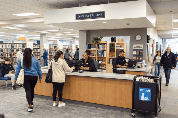
A Town Square® drop ceiling sign indicates where library patrons can check-out and return books with a librarian.
Audit Library Signage from a Visitor’s Perspective
When visitors become lost, adding another sign may not solve the problem. The real issue could be poor placement, inconsistent terminology, visual clutter, outdated information, or an existing sign that is difficult to notice from the approach route.
Research on conducting a library signage inventory recommends documenting how many signs a library has, what types they are, and their condition before deciding what should be added, replaced, relocated, or removed.
Evaluate signs for:
- Visibility from the visitor’s approach
- Clear and consistent destination names
- Readable letter size, contrast, and finish
- Appropriate placement at decision points
- Accessibility requirements
- Damage or outdated information
- Competition from posters and temporary notices
Then ask someone unfamiliar with the facility to locate common destinations, such as the information desk, an accessible restroom, a meeting room, a major service area, the elevator, and the main exit.
Observe where the visitor hesitates, backtracks, asks for help, or passes a sign without noticing it. Photographing those locations from the visitor’s point of view can also reveal hidden signs and competing messages that employees may no longer notice.
The goal isn’t to confirm that visitors arrive. It’s to identify where clearer wording, better placement, or a more coordinated library signage system could make the route easier to follow.
Create Visitor-Friendly Signs for Libraries and Public Facilities
The best library signage ideas begin with the needs of people who have never visited the building before. Coordinated library signs, directories, accessible signage, room identification, and visitor information can reduce uncertainty without adding unnecessary visual clutter.
The same approach applies to city halls, courthouses, and other public facilities: use consistent names, provide information where decisions are made, support words with meaningful visual cues, and test the finished system from a visitor’s perspective.
INTERSIGN designs and manufactures coordinated signs for libraries and public facilities, from ADA room identification signs and informational signage to directories and complete wayfinding systems. Shop sign solutions for your facility or contact our team for help planning a coordinated project.
About Dyta
Dyta Kodirun, a national account manager at Intersign, brings a unique perspective to the signage industry. Since 2013, she’s witnessed the meticulous process behind each handcrafted sign, from design to installation.
Her love for detail shines through, not only in her work but also in her hobbies – putting together puzzles and exploring nature with her canine companions.
